Our color styles were out of sync with production, sometimes we would use hex codes and developers would have to find a matching variable.

The color library we used in figma

The color scales available to use in production
Components in our design system were ahead of production. Meaning, our design system had the patterns the design team wanted to be implemented in the product but weren’t in production yet. This became a problem for our development teams as refactoring components creates added risk and could make QA difficult since the component that should be tested in production may not meet the expected behaviour.
Like many other fast-growing companies with a small but scrappy design team, there was no time (or budget) to spend resources on updating our design system. Regardless, our design system structure was becoming a blocker to our development teams being able to ship faster.
.png)
Calendar component in Figma
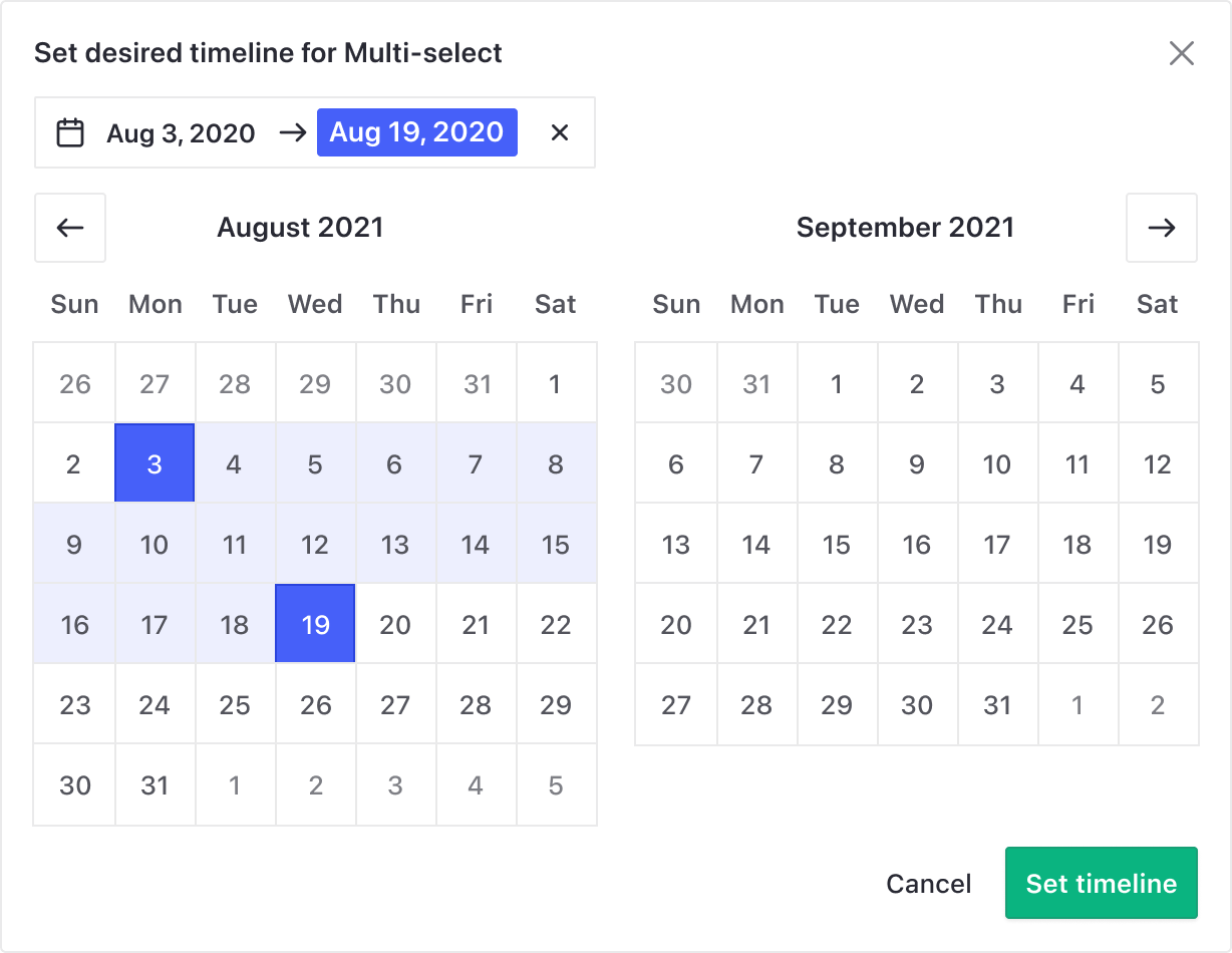
Calendar component in production
While the challenges in our design system were obvious, finding the time to retroactively go back and amend these issues was the true challenge. However, we knew this work needed to be done sooner rather than later to make room for dark mode. Here’s what our team did to solve our problem.
Design tokens are all the values needed to construct and maintain a design system — spacing, color, typography, object styles, animation, etc. When we pulled out our colour library in production, the team was shocked at the inconsistency between how many colors existed in production vs. what we thought we had available in our library. Taking a closer look at this helped us learn what terminology we were using, what was working, and what wasn't.
In partnership with our visual designer, we created the color palette we wanted to use moving forward. These colors were variants of our branding and were tested for color blindness.

Semantic libraries are easier to understand, that's why we moved away from purple-light, purple-lighter. If you work on a design team, you probably have had to explain your files to your colleague when they are working on them. Things like what color do we use for CTAs or which of these is used for the alerts?
We mapped the old scales to the new ones for our dev team to know what would be migrated.

We stopped designing with components that are ahead of the state of production and forced ourselves to be comfortable with code. To contribute to our design system, we now follow these steps:
Design systems are a team effort.
And, we hate to break it to you but it's likely never going to feel good enough! Embrace the true iterative nature of software design and development, and make a plan for how you can continue to iterate on your design system.
“At higher levels of elevation, components express depth by displaying lighter surface colors” - material design


In our design system, we have two layers of color variables: scales and themes.
Scales are where the raw color hex codes live. These values don’t change. Components won’t use these values directly, but the theme variables will point to them.
Themes are the stable API for components to consume. They are pointers to the scales, and represent a distinct functional value in the system.
Developers should be able to easily read the name of a variable and understand what it’s used for. Themes are managed via a specific set of theme variables that are swapped by simply changing a data attribute at the root of the application. Each set of variables is bound to a data-theme value which is applied at the app root, but could also support theming specific components as well.
All of the same variables but using different scale values
Now that theming is involved. color-text-primary in:
The scale values never change, scale-grey-80 is the same in all themes. But the text color references a different grey variable in the dark theme.
We moved from designing with hex codes to only using functional variables that are aligned with our code base, making it easier for the whole team to understand. This saves the developers time during handoffs and limits the margin of error for inconsistencies.

This also meant that converting a page from light mode to dark mode took only seconds. Designers only design in one theme, light theme, and if we want to see what it will look like in dark mode, we just switch variants from day to night. That sure makes it seem easy, right?

We learned that about 20% of our user base had OS appearance set to dark before we launched. However, we saw a 36% of adoption in the first week of the release day. That meant that 16% of our users switched to dark mode regardless of their OS preference.


Revamping our design system to make room for dark mode definitely taught our design team some hard lessons. The design team is now more involved in the development process and became familiar with the different libraries available in production. We reached parity between Figma and production, and built a consistent design system.
Connect with me
send me an email
or schedule a virtual coffee chat with me on calendly


